About Erin Libby

I am a painter, sculptor, illustrator, art educator and recovering commercial artist. I trained at the School of the Art Institute of Chicago, the University of Chicago, the University of California at Los Angeles, and Western Washington University, with a brief stint at Mexico City College. Mexico City College gave me my foundation technique of egg tempera. I am a working painter, currently showing at the Blue Horse Gallery in Bellingham and Gallery by the Bay in Stanwood, Washington. Look for my work in Fairhaven at Olivia Cornwall Gallery.

I've been teaching art for a very long time. I hope that you find this blog helpful.

Monday, July 26, 2010

The Line Between Drawing and Painting


Hard edge or fuzzy, thick or thin, delicate and crisp or vigorous and splashy the drawn or brushed on marks are what we have to make art.

I love the clean lines that describe form in a Botticelli painting and the brushy strokes of Chagall, or the hard edges found in Picasso or Leger.

So, where does line art leave off and painting begin? To explore this little mystery you might enjoy making a demo for yourself.

The experiment uses a few pieces of paper, such as ordinary copy paper (you can use your sketch book,) a ballpoint pen or Sharpie; something you can smear, such as charcoal or soft pencil; and some paint (cheap) and a narrow, all purpose house painting brush (99cents?).

Use black pens and paint, but you could use any color except yellow, which just does not show up well on the white background.

On one piece of paper, using the pen of choice, draw a line. You decide how long the line is to be. The idea is to look at your work and say, “Yeah, that’s a line, not a dot or a dash, but a realio-trulio line.”

Next, you make the line thicker/wider repeatedly until you feel comfortable saying, ”My line has become a shape. It looks like it could be something, perhaps a road or a strip of clouds.” Somewhere, between these two extremes is the very arbitrary transition point between line and shape. The moment of transition is personal to you, for you to use as a vehicle for ideas about imaging and design.

Sunday, July 18, 2010


Looking at Things

How we see, or perceive, is a complicated business. There is a long history of shifts in our seeing. In medieval times a painting of a phoenix was not just an image of a blue bird (possibly shaped like a chicken with a long neck), it was Christ to the viewer, possibly seen as if in a vision. The artist knew that any person who looked at the work would respond with this emotive understanding. In our century, even when we know that the bird is supposed to stand for Christ, we no longer have the ability to see with eyes, free from all intellectualism. Now, it is up to the artist to guide the viewer toward sharing what we feel.

So, your job, as an artist, is to locate your own response to what you see in the world around you and to find a language of marks and colors that take the viewer along your path. You do this by trial and error and by reverie.

Reverie is something hard to come by. Ideally, there would be no phones, no TV, no babies on your lap, and having thrown your watch into the brink. Well, maybe dropped in a pocket, at least, mentally. But, sketching will take you there with distractions all around you.

Whether you are at home, traveling, or waiting, just waiting, try selecting your sketchbook rather than a magazine or the computer or IPhone and spend a small length of time alone with what your hand does. You will find that the relationship of moving your hand, making lines, making choices, will lead you closer to losing all sense of time, leading to imaginative reverie.

OK. You might have to set a wee alarm so that the chicken in the oven does not get burned.

Friday, July 9, 2010


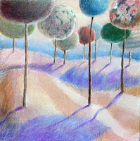
Jester Parade, Forward Progress, and Balltrees

Sneaking Up on Painting

You could just plunge in and start painting. Some beginners do. Often, it works. I am of the sneak-up temperment. So, let me share what, for me, is the simplest overall look at how colors work.

You know the way, the manufacturers make up names for colors, such as “Seaside Blue”, “Sunset Red” or “Buttery Yellow.” I think this is an indication that we all have trouble determining the differences between blues, blue-greens, turquoisey-blue-green or between sort of maroonish, dark red- purple, etc. The truth is, in painting, it is often not essential to put a name to the color you like. And there are no absolute rules about how colors are used, so, If you want to paint a landscape entirely in shades of red, that is your call.

To make talking about colors easier, I group them into two batches: cool colors and warm colors. The category “cool” contains all the blues and greens and most purples. “Warm” colors are all the reds, oranges and yellows.

The coolest blue is the one with little or no trace of either red or yellow. As blue begins to have a greenish cast, which means there is a yellow aspect, it is a warmer blue. The same with greens, which start very blue-green and, adding more yellow, become chartreuse as the bump into the warm tones.

Reds are coolest as a “warm color” at true red and rise in temperature as orange and blazing yellow appear, then taper off in temperature as the yellow swings toward green.

To be honest, evaluating the line between the coolest purple (most blue) and the warmest (turning into magenta) can be subtle and depends a lot on the context. As I said earlier, this is where manufacturers describe a color as “Soothing Lilac” or “Springtime Orchid”

Having this primer language of color allows you to establish areas in your painting that have nice transitions. If you are adding color to your line drawing in your sketchbook, you can play with warm colors in the foreground and cool colors to indicate distance.

Use of color is very individual. You are “allowed” to have fun with painting with color. And, yes, someone is always making guidelines, rules and charts. At some point, you may find that some structure very helpful. Initially, I hope you just explore.

Thursday, July 1, 2010

Working in a Series.

Marching Box Prancing Box


Two pages of boxes


I have included three pages from the same sketch book. They are scattered through the sketchbook, done on different days. I did the "MarchingBox" first, I decided the idea needed more animation and I made a rapid sketch of a box with Prancing legs.
Not finished with the box that wasn't a box, I did the Beastie one. Here, I did the first version in pen, then, on the previous page, I did a pencil of the same critter seen from the back.

Recently, I did a colored version of this concept. Apparently, I am still playing with the busy Box.

There is an obvious randomness in the nature of sketchbooks. You tend to draw what you encounter, what strikes your fancy and what you come upon. You may also use the book to make written or drawn notes to yourself that arrive in your brain of their own volition.

I want to talk about “series” thinking and “threads”. As you go along, enjoying just the process of jotting things down, you will find yourself becoming aware of something you have done that appeals to you. You may have created a certain squiggle that you like, caught the sweep of a tree branch with telling energy, or used a title that lingers in your imagination.

What charms you may have to do with the way your pencil shaded the sunlight from shadow to light.

It is out of these almost accidental stimuli that you will begin to function as an artist. If it catches your eye, if you go back to that page, if you find yourself lingering over a page of sketches, then explore what has been emerging, that is what leads to creation. Putting a name to it sometimes helps. You might say,” I love the way the center of this flower is pressing so hard to get out.” When you have been out and about: “ The faces of people when they are watching a boat race are so intense!” With your sketches you will learn to put thoughts and feelings into what you visualize.

Take the element that has caught your attention and deliberately explore further. It is fine if you do two or three studies, exhaust your new ideas and drift off to another topic. Some art has to sit and simmer.BUT, you have recorded the moment of interest in your sketchbook,( that invaluable tool,) and can resume working on what excites you at any time.

Doing a series of studies with one technique or one idea gives you the confidence to know what is your personal “take” on the subject. This is how you grow art.

Sunday, June 27, 2010

Dressing up Your Sketchbook


One of the first signs you are making progress is that moment when you have been drawing and drawing and begin to wonder,"where is this going?"

Line is expressive. It is elegant. It is very personal. Just as with your handwriting, your drawn line is yours and yours alone. Some artists, particularly cartoonists, spend a lifetime perfecting their line art.

Nonetheless, you may want to enhance the pages of your book with more dramatic features.
Here are some steps which will enliven an existing sketch and be part of the next phase of your art.

Select a tool to make some very black areas, being careful that the dark does not bleed through to the other side (or to the next page.) Sharpie's are dangerous. A soft pencil is good. Can you get a 6B or 9B? ( These soft, dense graphite lines and areas need to be sprayed with a workable sprayfix or they will rub off, transfer to the back of the previous page, as well as get smudged .)

Pen and ink or brush and ink work well. I am addicted to ball point pens. Try a pen with a pointed felt "brush" tip. These come in colors, too.

Which black areas? Try making a dark background, if you think your shapes are simple enough. Experiment with patterns. You can add more lines to create a dense and dramatic form.

Of course, you can use water color or acrylic for your dramatic darks. Just mind the thickness* of your sketch book paper. Thinner papers wrinkle with water color and the paper puckers with acrylic (it shrinks as it dries).

You might want to move slowly. Take a single move forward and play with it. You will find that your hand naturally wants to shade, make sort strokes, create little dots and swirlygigs.

I have posted one merfish with a decorative pattern of blotches and another where the line work begins to give a sense of form and the suggested water places the creature, giving a hint of depth to the scene.

* Thickness is described by "weight." A standard weight for watercolor paper is 140lb. Most sketch books are far lighter than that, but a few have multiole sheets of watercolor paper sandwiched between lighter weight sheets.


“The ‘Look’ of Sketchbooks”

Sketchbooks come in all kinds of flavors. Art Supply companies treat us to a new variety every season.

Here is what counts--archival paper ( meaning it is acid free and will not turn brittle and yellow over time) and that the book will lay flat when opened.

You may want a tiny one, exchanging the ease of tucking it in a pocket for the extra size and several more pages in a larger book. That results in needing to buy a succession of books. Keep them dated or numbered, Ok?

Expensive bindings and beautiful paper may inspire you. Or, inhibit. Sometimes noting that I am about to lay an ink line down on a fabulous surface just stops me cold.

Medium sized and medium priced books are functional. I use the pocket size when I go out and the larger ones at home.

Some artists want a foldout book. It acts as an ongoing story, which, like a Chinese scroll painting tells about an adventure.

For the beginner, focusing your attention is helpful. You might want boundaries rather than the unfolding, open-ended story. Try making little square or rectangular “boxes” to a page. Practice working within confined shapes. Let the limits sharpen you sense of composition and design. You can always scrawl all over the next page. It is your book. It is to learn with and for play.

I use a ball point pen a lot. With pencil, you can erase, but I always lose my eraser. Pencil art really shoould be given a light coating of workable spray-fix.
There are days when my rectangles are more accurate than others. I work towards "fast," more than accurate. Note: I made no location or date notes! oops!
This book is about 8"x8."