Prints for sale!!! I often get requests for prints from my paintings. Some are up at fineartamerica.com. More to come, slowly.
This is what I found out about digital print on demand: I had to go back to the original photograph, direct from the camera, of the paintings to get enough resolution for the printing process. Sometimes I have to reshoot the painting. The process works if the original image is color-corrected in Photoshop, but not downsized or re-sampled.
I took a master class in egg tempera painting in England in October, 2012. Wow, Koo Schadler really knows how to take a good painter and move forward to excellent and amazing. The excellent painters moved forward to mastery. Two of my classmates, Sara Harding and Paige Barry, are on facebook, and you can see their work.
One of the things that Koo does is to really spend time on her prep work. She sets up her still life with an eye to what a painter from 1450 would reaching for. The focus is on directness and simplicity. She then takes a photograph lit with a single light source. When she has the composition resolved to her satisfaction, she works mostly from the photograph.
The result is intimate and masterful. Egg tempura is both translucent and precise. The image glows in way that it cannot be acheived in any other media.
Of course, it's tremendously painstaking. Egg tempera paintings are tiny and time comsuming. No wonder the impressionists would rather glob on oil paint. So much less work and a larger scale for the emotional impact.
After Koo's help, I came home and spent several hours redoing my last egg tempera painting. It's called "Mudmask Luncheion." It's a goup of somewhat improbable people having an improbable picnic. The lady in the mudmask is the beauty that you always have to invite to the party.
Friday, November 9, 2012
Tuesday, March 20, 2012
A visit to Seattle
Yesterday, March 20. 2012, I took advantage of my SAM membership to see the Gauguin show in Seattle. Kiki Cardarelli went with me. Much of it was spectacular. As always with shows including works borrowed from other collections, no photos were allowed. I bought the catalogue. We had parked at a public structure a couple of blocks up the hill from the museum and daunted by the size of the book, I asked them to ship it home.
Kiki led me to a restaurant at Pike’s Place market, where we watched the grey water slosh under an equally gray sky and admired the red accents of cranes waiting there for containers to unload. The ferry arrived to snug against the buildings cluttered at the water’s edge and I decided against eating another French fry. Traffic was light going home.
I look forward to the catalogue arriving so that I can study the images and reference them against the experience of seeing the actual work. The ferocious impact Gauguin made upon me when I was nineteen has weakened some, and I see him as more adroit than savage, but his urge to dig out emotions at that layer below the everyday social world is, oh, so worth holding onto.
Sunday, September 12, 2010
accidents and intentions
There is a phrase, "happy accident" that is important to the artistic process. You can use the phrase to cover your bleeps, much as you would say."excuse me" after a burp. The real meaning is deeper and a bit more complex.
The artist is something like an orchestra conductor, who plays one element against another, lets this aspect become dominant, and muffles another. To make the complex overlayering of tasks that must be held in your head at the same time, easier to handle, there are multiple ways to break down the creation of a painting into segments that can be dealt with separately. I will talk about that later. Right now, I want to talk about accidents and intent.
Accidents are the ways that paint can do the unexpected, that your hand follows a path seemingly all on its own, and you wind up with a squiggle or a color or a bloop that you had not planned for.
In some works, that means trouble. You have to dig out the eraser, or sop up the paint, or whatever is needed to eradicate this shift in direction. Some pieces of art are tightly planned and every move is designed in advance, with no room for experimentation mid-course.
Then, there are works where a certain playfullness is present, where you are willing to let the result be a bit of a surprise. Frequently, the accidental change in what you have, from what you thought you wanted, is a plus. Sometimes this one spontaneous "mark" can change the entire direction of the picture.
How do you tell the difference between a booboo and a delightful present from the Muse? It is hard. The best advice I can give is to train yourself to pause. There is a huge impulse to rush instantly to obliterate the offensive deviation from what you thought you wanted. Don't. Give yourself time to look again at what you are making. Then,drop your insight into the core of your spirit down a notch, going below the desire to make things "right" and find something that tells you what it is you really want to paint.
Then, if anyone happens to ask you how you got that wonderful effect you can answer,"oh, it was a happy accident," or you can smugly say nothing and let them appreciate your skill. Leaving, identifying, an accident takes considerable skill.
I don't have an image to post along with this blog. It is rare that I can take a photo of the exact moment when magic happens. It always happens in an instant. Have fun.
Wednesday, August 11, 2010
Moving Out From Your Sketchbook
 color sketch
 Tissues for transfer
 Egg Tempera painting
 Original sketchbook concept
Moving out from your Sketchbook
You may have drawn something in your sketchbook that you like and are considering using as the basis for a painting. There are several ways to transfer your art from the book to a painting surface. I am going to tell you about one method. It involves the use of a copy machine, tracing paper, a standard #2 pencil, tape (blue painter’s paint), a soft eraser, optional fixing spray, a soft pencil* or charcoal or conte’ crayon and a ball point pen.
First, scan your sketchbook image into a copy machine. You may want to printed image to be larger than your drawing.
Lay your resulting print on a firm surface. Tape the corners with an easily lifted tape, such as the “blue”. Put a layer of tracing paper over your original and, using the #2 pencil, copy your artwork onto the tracing paper.
Take your newly made drawing and turn it over, setting the sketchbook aside. Apply the soft pencil, or charcoal or conte’ to the back. You can buy transfer paper already covered with graphite at the art supply store. It is less messy.
Place the tissue with its coated side down on the paper or canvas you wish to use. Tape the tissue at the corners. With a ballpoint pen, go over all of your lines. I like to use a blue pen so that where I have traced is clear to see. You can lift a corner and peek, checking to see that you have transferred all the bits and pieces. I check frequently.
Remove the tracing paper. You may want to spray a light coat of workable fixative. If you are planning a watercolor, use pencil only and do not spray. You are ready to paint.
Being able to move from your sketchbook to a larger surface, either to paint or to carry the drawing to another level, gives a new meaning to your impromptu drawings.
I am including the steps I took to create a tiny egg tempera painting. It is 4x4" on a gesso panel. Egg tempera is , well, just what it sounds like: you take powdered pigments and "temper" them with egg. Tha egg, with a little water mixed in, creates a glue , holding the dry colors to the surface of the white chalk-like board. The gesoo is absorbent. The water sinks in and dries along with the eggy surface. The resolting colors are somewhere between transparent and opaque. They are lustrous and the work has an inner glow. My experience with the medium is that it encourages detail and can seem a bit reluctant to blend. I had not used egg tempera in maybe fifty years. I decided not to try anything too ambitious.
Step by step: I found a Punch and Judy sketch I had done a while back. It has a lot of vitality, with scratched over lines and an emphatic mood. The original is 5x5." The panel had already been prepared at a smaller size. Normally I would have popped it on my copier and downsized. my copier is not working, so I eyeballed the downsize. The first attempt was quite rough.
I redrew, again, on tracing paper, this time looking at the mood of the original, trying to capture what I liked about it.
When I was satisfied with my line art, I made another very loose sketch of what I had on the tracing paper, but using ordinary copy paper. I added a hint of trees and the water. I put a suggestion of patterning onto my figures, and I indicated the color scheme.
Going back to my tracing paper drawing, I now transfered it to the panel. I began painting by making a weak solution of egg and brown color to paint over the chalky line. As with water colors, you dare not spray fix your drawing because the water proof spray will ruin the absorbency of your surface.
Egg tempera is slow and takes patience. I made myself stop, walk away, let it dry, come back later, many times. There is an excellent book on this medium by Koo Schadler, "Egg Tempera Painting," which you can purchase by going to her web site.
Monday, July 26, 2010
The Line Between Drawing and Painting

Hard edge or fuzzy, thick or thin, delicate and crisp or vigorous and splashy the drawn or brushed on marks are what we have to make art.
I love the clean lines that describe form in a Botticelli painting and the brushy strokes of Chagall, or the hard edges found in Picasso or Leger.
So, where does line art leave off and painting begin? To explore this little mystery you might enjoy making a demo for yourself.
The experiment uses a few pieces of paper, such as ordinary copy paper (you can use your sketch book,) a ballpoint pen or Sharpie; something you can smear, such as charcoal or soft pencil; and some paint (cheap) and a narrow, all purpose house painting brush (99cents?).
Use black pens and paint, but you could use any color except yellow, which just does not show up well on the white background.
On one piece of paper, using the pen of choice, draw a line. You decide how long the line is to be. The idea is to look at your work and say, “Yeah, that’s a line, not a dot or a dash, but a realio-trulio line.”
Next, you make the line thicker/wider repeatedly until you feel comfortable saying, ”My line has become a shape. It looks like it could be something, perhaps a road or a strip of clouds.” Somewhere, between these two extremes is the very arbitrary transition point between line and shape. The moment of transition is personal to you, for you to use as a vehicle for ideas about imaging and design.
Sunday, July 18, 2010

Looking at Things
How we see, or perceive, is a complicated business. There is a long history of shifts in our seeing. In medieval times a painting of a phoenix was not just an image of a blue bird (possibly shaped like a chicken with a long neck), it was Christ to the viewer, possibly seen as if in a vision. The artist knew that any person who looked at the work would respond with this emotive understanding. In our century, even when we know that the bird is supposed to stand for Christ, we no longer have the ability to see with eyes, free from all intellectualism. Now, it is up to the artist to guide the viewer toward sharing what we feel.
So, your job, as an artist, is to locate your own response to what you see in the world around you and to find a language of marks and colors that take the viewer along your path. You do this by trial and error and by reverie.
Reverie is something hard to come by. Ideally, there would be no phones, no TV, no babies on your lap, and having thrown your watch into the brink. Well, maybe dropped in a pocket, at least, mentally. But, sketching will take you there with distractions all around you.
Whether you are at home, traveling, or waiting, just waiting, try selecting your sketchbook rather than a magazine or the computer or IPhone and spend a small length of time alone with what your hand does. You will find that the relationship of moving your hand, making lines, making choices, will lead you closer to losing all sense of time, leading to imaginative reverie.
OK. You might have to set a wee alarm so that the chicken in the oven does not get burned.
Friday, July 9, 2010


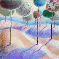
Jester Parade, Forward Progress, and Balltrees
Sneaking Up on Painting
You could just plunge in and start painting. Some beginners do. Often, it works. I am of the sneak-up temperment. So, let me share what, for me, is the simplest overall look at how colors work.
You know the way, the manufacturers make up names for colors, such as “Seaside Blue”, “Sunset Red” or “Buttery Yellow.” I think this is an indication that we all have trouble determining the differences between blues, blue-greens, turquoisey-blue-green or between sort of maroonish, dark red- purple, etc. The truth is, in painting, it is often not essential to put a name to the color you like. And there are no absolute rules about how colors are used, so, If you want to paint a landscape entirely in shades of red, that is your call.
To make talking about colors easier, I group them into two batches: cool colors and warm colors. The category “cool” contains all the blues and greens and most purples. “Warm” colors are all the reds, oranges and yellows.
The coolest blue is the one with little or no trace of either red or yellow. As blue begins to have a greenish cast, which means there is a yellow aspect, it is a warmer blue. The same with greens, which start very blue-green and, adding more yellow, become chartreuse as the bump into the warm tones.
Reds are coolest as a “warm color” at true red and rise in temperature as orange and blazing yellow appear, then taper off in temperature as the yellow swings toward green.
To be honest, evaluating the line between the coolest purple (most blue) and the warmest (turning into magenta) can be subtle and depends a lot on the context. As I said earlier, this is where manufacturers describe a color as “Soothing Lilac” or “Springtime Orchid”
Having this primer language of color allows you to establish areas in your painting that have nice transitions. If you are adding color to your line drawing in your sketchbook, you can play with warm colors in the foreground and cool colors to indicate distance.
Use of color is very individual. You are “allowed” to have fun with painting with color. And, yes, someone is always making guidelines, rules and charts. At some point, you may find that some structure very helpful. Initially, I hope you just explore.
Subscribe to:
Posts (Atom)