

Jester Parade, Forward Progress, and Balltrees
Sneaking Up on Painting
You could just plunge in and start painting. Some beginners do. Often, it works. I am of the sneak-up temperment. So, let me share what, for me, is the simplest overall look at how colors work.
You know the way, the manufacturers make up names for colors, such as “Seaside Blue”, “Sunset Red” or “Buttery Yellow.” I think this is an indication that we all have trouble determining the differences between blues, blue-greens, turquoisey-blue-green or between sort of maroonish, dark red- purple, etc. The truth is, in painting, it is often not essential to put a name to the color you like. And there are no absolute rules about how colors are used, so, If you want to paint a landscape entirely in shades of red, that is your call.
To make talking about colors easier, I group them into two batches: cool colors and warm colors. The category “cool” contains all the blues and greens and most purples. “Warm” colors are all the reds, oranges and yellows.
The coolest blue is the one with little or no trace of either red or yellow. As blue begins to have a greenish cast, which means there is a yellow aspect, it is a warmer blue. The same with greens, which start very blue-green and, adding more yellow, become chartreuse as the bump into the warm tones.
Reds are coolest as a “warm color” at true red and rise in temperature as orange and blazing yellow appear, then taper off in temperature as the yellow swings toward green.
To be honest, evaluating the line between the coolest purple (most blue) and the warmest (turning into magenta) can be subtle and depends a lot on the context. As I said earlier, this is where manufacturers describe a color as “Soothing Lilac” or “Springtime Orchid”
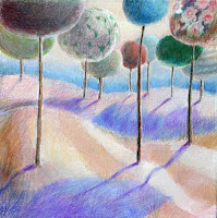
Having this primer language of color allows you to establish areas in your painting that have nice transitions. If you are adding color to your line drawing in your sketchbook, you can play with warm colors in the foreground and cool colors to indicate distance.
Use of color is very individual. You are “allowed” to have fun with painting with color. And, yes, someone is always making guidelines, rules and charts. At some point, you may find that some structure very helpful. Initially, I hope you just explore.
No comments:
Post a Comment